


The only thing I like less than writers who write about writing is Substack bloggers who sacrifice the first fruits of their pens upon the altar of Substackery. Nonetheless, having poured far too much of the milk of human kindness on this morning’s oatmeal, I feel obliged to risk a weekend’s worth of self-loathing, as well as well-deserved accusations of hypocrisy, in order to share, with my fellow members of the Ancient and Honorable Company of the Keyboard, some things I have learned about the peculiar peculiarities of this platform.
Substack Likes Internal Linking
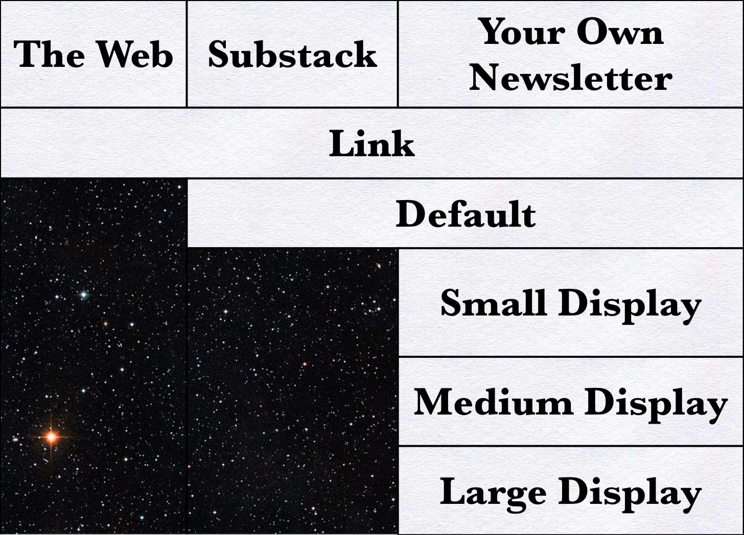
Substack provides one way to build corridors to pages on the internet as whole, two ways to connect to other publications on this platform, and five ways to draw readers to pieces published within the borders of a given newsletter. This pattern of distribution suggests, at least to my mother’s best-looking son, that people with influence on the inner workings of Substack want you to festoon your pieces with portals to previous posts.
Links and Defaults
The unadorned link consists of a line drawn beneath the phrase, word, or, marvelous to say, stand-alone character (ð), connected to a page anywhere on the world-wide web. (As you can see from the example, the character need not belong to the alphabet you are using.)
The line does little to catch the eye. Nonetheless, the fact that it has been used widely for a good quarter century makes it familiar to most readers. Indeed, I have found that some of the most fruitful portals I have planted have been links of this painfully pedestrian type. (For the purposes of this paragraph, ‘fruitfulness’ of a link equates to the number of clicks it manages to garner.)
The default that permits readers to jump from one Substack newsletter to another takes up far more space than a slash of underscoring. It also provides the reader with a lot of information about the destination on offer. (At the very least, this reassures the reader that a click will take him somewhere somewhat safer, and far less malodorous, than the digital analog of a rat-ridden, dumpster-filled back alley.)

How Displays Display Pictures
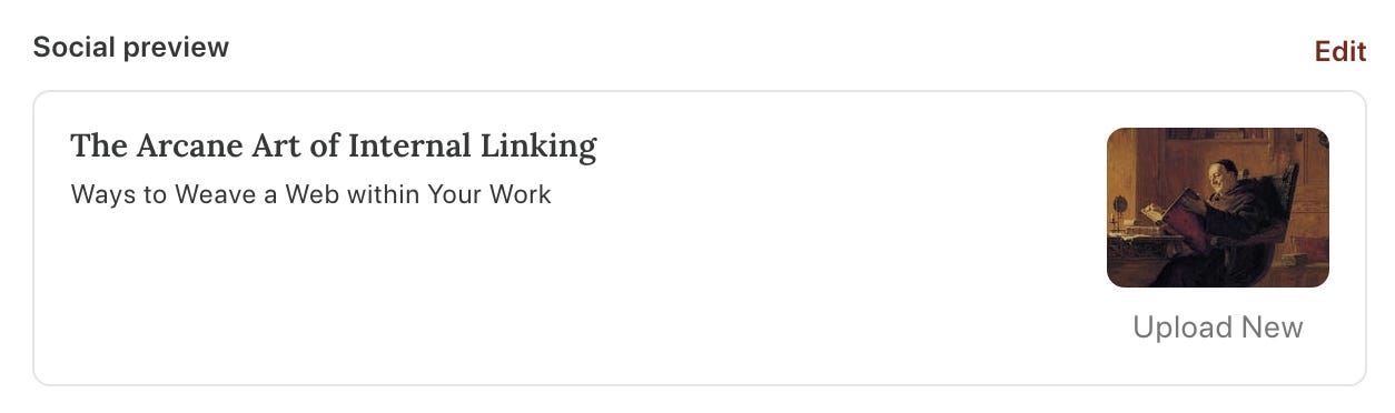
Each of the portals that Substack calls a display features a thumbnail of the primary picture of a post. (This is the picture you selected for your ‘social preview’ on the Publish page. If you decline to upload such a picture, a version of the first image that appears on your post will appear in that space.)
The thumbnail used with the large display takes the form of a rectangle. Indeed, if the primary picture is formatted as a standard Substack rectangle (1,456 x 1,048 points), the thumbnail will be a miniature version of the full picture.
The thumbnails included with the medium and small displays will, however, show but a portion of the original picture. In particular, if they start out as rectangles, they will experience a degree of sideward diminution.
Consider, if you will, the case of painting used to illustrate ‘Twould be a Shame to Skip This Post. While the full picture depicts the heads and shoulders of all five of the people portrayed, the latterly lopped version deprives each of the outboard ladies of an arm and an ear.
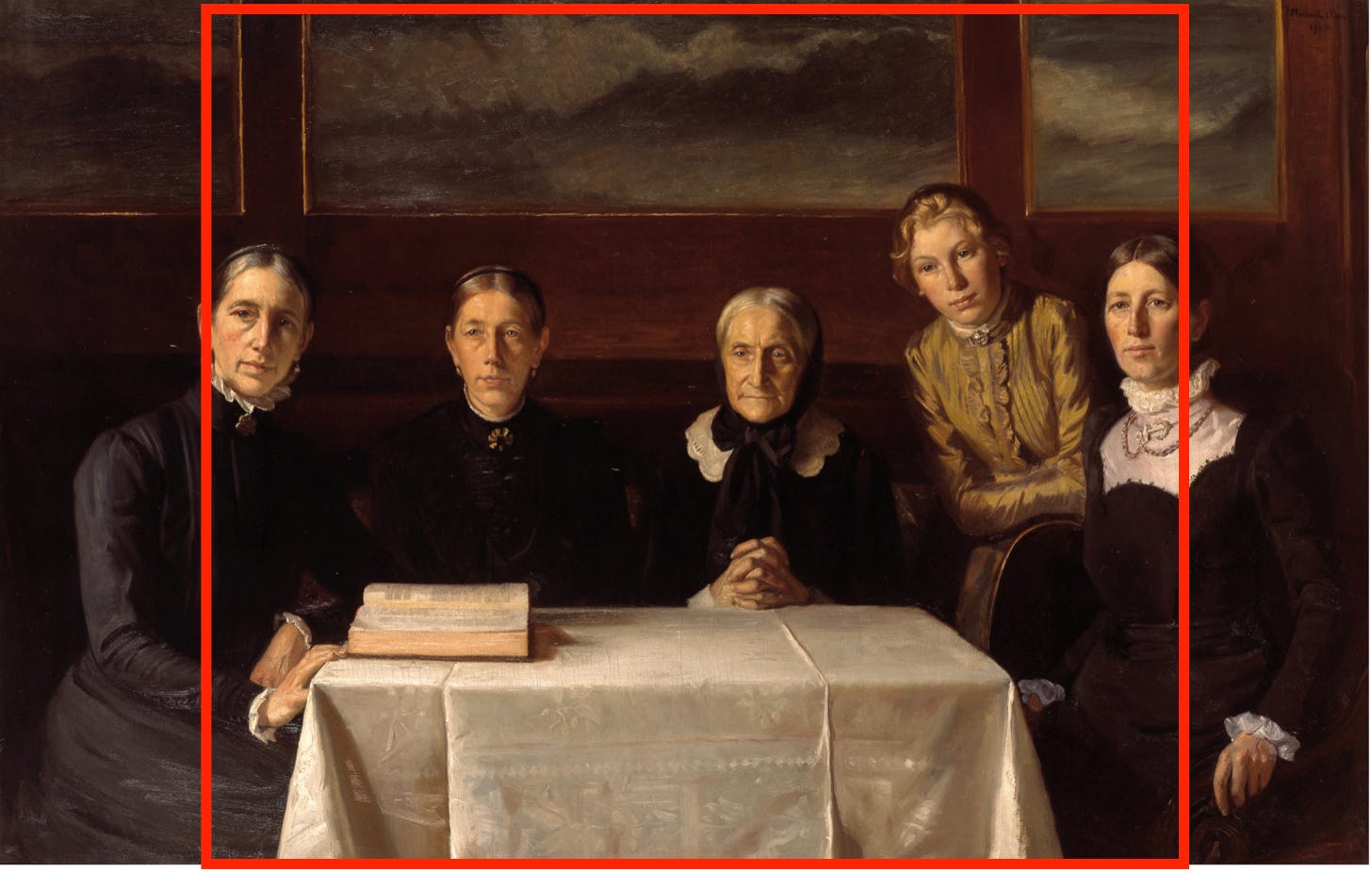
In some cases, this sort of slicing does little to deprive an image of its overall effect. After all, the most important part of a well-composed painting (or photo) can often be found in the middle of the picture. (And yes, Mormor, this is how we know the painting is all about you.)

If, however, you wish to emphasize one side of a picture over another, you will have to do some trimming of your own. Thus, for example, if you wish to create a thumbnail out of the part of the picture that is home to the grandmother, granddaughter, and mother, you can convert the original rectangle into a square.
This will provide you with displays centered on the young woman in the gold dress.
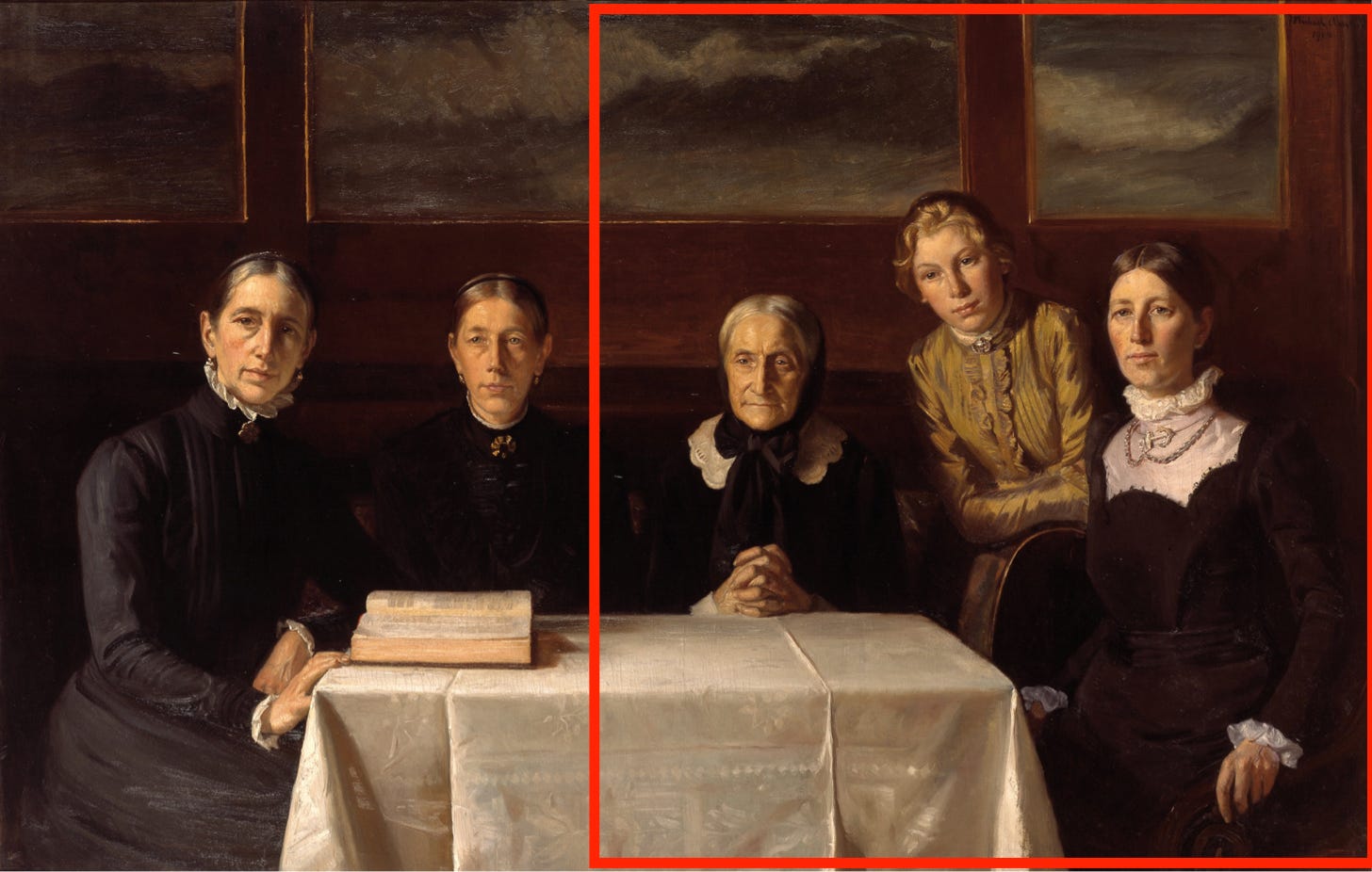
The small and medium versions of the resulting displays will retain the shape of the square that you made. However, when making the large display, the razor-wielding Substack elves will take slices off of the top and the bottom of the picture, thereby turning it into a rectangle.
Please note that this second rectangle will show but a portion of original picture. That is, it will reflect the result of two successive trimmings.
'Twould be a Shame to Skip This Post

In the teens of the present century, an age of wonders in which airlines beamed entertainment onto little screens on the backs of passenger seats, I watched The Shamer’s Daughter. Based on a Danish young adult novel of the same name, this movie recounted the adventures of a medieval lass who discovered that, li…
Effect Upon Layout
The page layout I use for Extra Muros formats some pictures as rectangles and others as squares. Thus, when I select the primary picture for each article, I prefer rectangular images, like the portrait of the monk that I placed at the top of this post, that can easily withstand a bit of lateral lopping.
If I cannot make that work, I cut a square out the picture at the top of the article and upload it as my ‘social preview’. When I do this, moreover, I take care to make an image that will be able to withstand ‘a little off the top’ and ‘a little off the bottom’.
For Further Reading:

To Share, Subscribe, or Support:

Thanks for the tips!